Bar chart of mean plant height by fertiliser with error bars drawn from each low value to its high value, as given. fertiliser, mean (cm), low (cm), high (cm): none 12.4 11.3 13.5, A 15.8 14.4 17.2, B 17.2 16.0 18.4, C 14.9 13.3 16.5. y axis: height (cm).
Forma Visuals · Chart your data · Examples
Bar chart with error bars
Group means as bars, with error bars from the low and high values in the request, for a report or a poster.
For students and scientists · Vega-Lite
Try it in the consoleOpen the Vega-Lite editor
The playground allows illustrative values: any number your request does not give, Forma writes, and the answer says generated. Over the API and MCP, that request is refused unless it sets allow_generated_data.
01 The chart
Drawn from the code that came back.
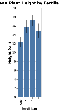
valid · chart@cb3749b2 · 1 credit · 2026-10-07
Sent with the API's default setting, under which a chart is drawn only from values the request gives.
02 The request
In plain words, with its values.
03 What came back
A Vega-Lite spec.
Indented for reading.
{
  "$schema": "https://vega.github.io/schema/vega-lite/v6.json",
  "name": "plant_height",
  "data": {
    "values": [
      {
        "fertiliser": "none",
        "mean": 12.4,
        "low": 11.3,
        "high": 13.5
      },
      {
        "fertiliser": "A",
        "mean": 15.8,
        "low": 14.4,
        "high": 17.2
      },
      {
        "fertiliser": "B",
        "mean": 17.2,
        "low": 16,
        "high": 18.4
      },
      {
        "fertiliser": "C",
        "mean": 14.9,
        "low": 13.3,
        "high": 16.5
      }
    ]
  },
  "title": "Mean Plant Height by Fertiliser",
  "layer": [
    {
      "mark": "bar",
      "encoding": {
        "x": {
          "field": "fertiliser",
          "type": "nominal",
          "sort": null
        },
        "y": {
          "field": "mean",
          "type": "quantitative",
          "axis": {
            "title": "Height (cm)"
          }
        }
      }
    },
    {
      "mark": "rule",
      "encoding": {
        "x": {
          "field": "fertiliser",
          "type": "nominal",
          "sort": null
        },
        "y": {
          "field": "low",
          "type": "quantitative"
        },
        "y2": {
          "field": "high"
        }
      }
    }
  ]
}
04 When to use it
Where this chart helps.
- Comparing the means of a few groups, with the spread of each.
- The bars run from the low and high values you give. Work them out first, for example the mean plus and minus one SD.
- Say in the caption what the bars show, so the reader knows.